My Time at CUP: Linda Secondari

“As a designer, there is no higher honor than to develop an identity for an organization.”

Linda Secondari
CREATIVE DIRECTOR AND PRINCIPAL
STUDIOLO SECONDARI
COLUMBIA UNIVERSITY PRESS, 1983–2008
- SENIOR DESIGNER, 1993–1995
- DESIGN AND PRODUCTION MANAGER, 1996–1999
- CREATIVE DIRECTOR, 1999–2008
> I joined the Press as a young book designer, in search of a more gratifying career after having spent three years as junior art director in a Times Square advertising agency. At CUP I found what I had been looking for: an intellectual environment with engaged and friendly people. My design work was going to be used to further a great mission, to disseminate knowledge.
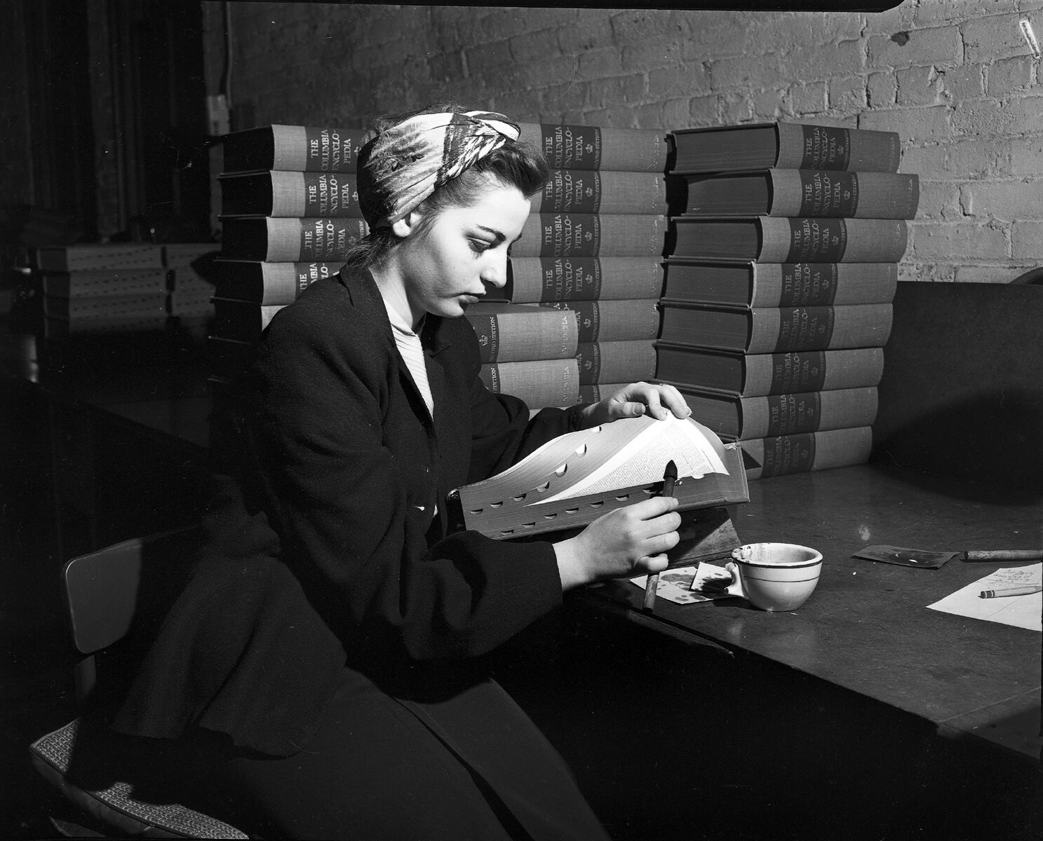
In 1999, all anyone could talk about was the Millennium. Y2K mania was gripping the world, and CUP was no different. I had recently been promoted to creative director, in charge of manufacturing and technology. In that capacity, I approached our director, Bill Strachan, about rebranding the press. My pitch was that we should take the opportunity provided by a new millennium and the upcoming publication of the sixth edition of our cornerstone Columbia Encyclopedia to reconceive our visual identity. I felt we needed to shift from the rather old-fashioned crown logo that we were using then. We were a forward-looking publisher adapting to the changes in the publishing environment brought on by digital technology, and I felt we should highlight that. Of course the brand would need to signify that we continued to be firmly rooted in our mission of supporting the distribution of scholarship of the highest quality. Bill accepted the offer, and we worked with key stakeholders within and beyond CUP to dig deep into our value proposition, our mission, and our audiences to develop a strategy that would support the creation of a new brand for the Press.
The logo and brand identity that resulted from our labors and those of Studio Grant are still something I am very proud of. We kept the concept of the crown, but we modernized it. We married the idea of a crown with an open book. The new logo also alluded to networks and dissemination. The result was a contemporary logo that conveyed the legacy of the Press and its relationship with the University while maintaining a steadfast gaze toward the future. The elegant and dynamic symbol is synonymous with CUP now. It reflects the ideals that we defined in our brand explorations and continues to beckon to the future.
As a designer, there is no higher honor than to develop an identity for an organization. I am very proud that the brand continues to grow with the Press and reflect its continuing mission. Although I left the Press in 2008 I remain a fan of the publications of this great institution and am so proud of its continuing efforts to publish the best scholarship in a wide range of subject areas.