Three Ways to Present a Data-Rich Table
“It can be tempting to present all of your data, estimates, and regression results in your presentation. But that’s what your paper is for. In a presentation, be kind to your audience and make it easier for them to absorb and understand your content.” — Jonathan Schwabish
The following is a guest post by Jonathan Schwabish, author of Better Presentations: A Guide for Scholars, Researchers, and Wonks. This post was originally published on PolicyViz, on December 8, 2016.
Three Principles of Effective Scholarly Presentations
By Jonathan Schwabish
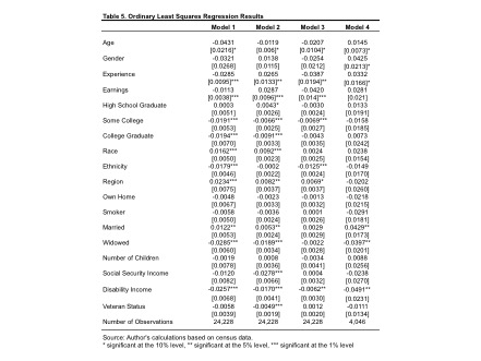
Researchers and analysts have some unique challenges when it comes to presenting their data and analysis. We are often more focused on the data, statistics, and estimation results than soaring rhetoric or specific calls to action. That means we’re prone to showing overly dense, data-rich tables—even though the audience can’t both decipher all those numbers and listen simultaneously.
In my new book, Better Presentations: A Guide for Scholars, Researchers and Wonks, I explain how to create, design, and deliver effective presentations. If you’re in the habit of showing dense, data-rich tables, here are three things you can do to make it easier for your audience to follow your content.
1. Focus on the most important numbers. Yes, we know you’ve run the regression with 10 control variables and dummy variables for all 50 states, but you’re not going to talk about all of them, and we don’t really care to see all of them. It’s really those two or three estimates that are the most important, so edit the table from 150 numbers down to the most important ones. If need be, you can give your audience a handout with the full table or maybe just point them to the full paper where you’ve probably already included it.
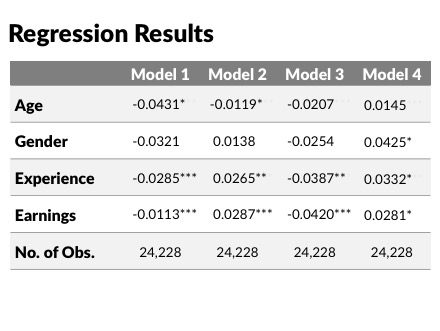
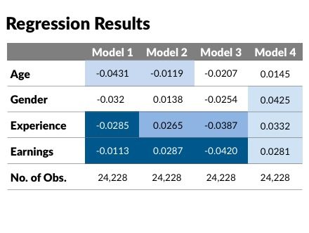
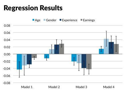
2. Put them in a graph. The way our eyes and brains work together allows us to better grasp and retain information through pictures rather than just through words (this is known as the “Picture Superiority Effect”). So take your dense graph and convert it to a table (also, see point #1 about reducing the number of estimates you actually show).
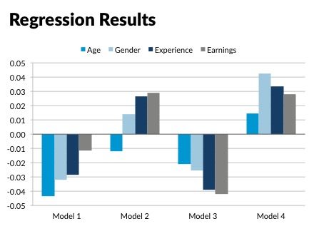
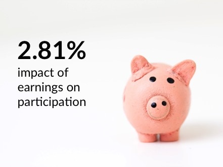
3. Don’t show a table at all. If it’s really just one or two numbers you are going to focus on in your presentation (note that I differentiate here between what you focus on in your presentation versus what you might discuss in more detail in your paper), then maybe a table isn’t need at all. Just including the final number in large type with an image or statement will suffice. Presentations are a fundamentally different form of communication than your written report, so treat it as such.
It can be tempting to present all of your data, estimates, and regression results in your presentation. But that’s what your paper is for. In a presentation, be kind to your audience and make it easier for them to absorb and understand your content—cut to the core of your ideas and highlight the most important findings and conclusions.
Read the original post at PolicyViz.


